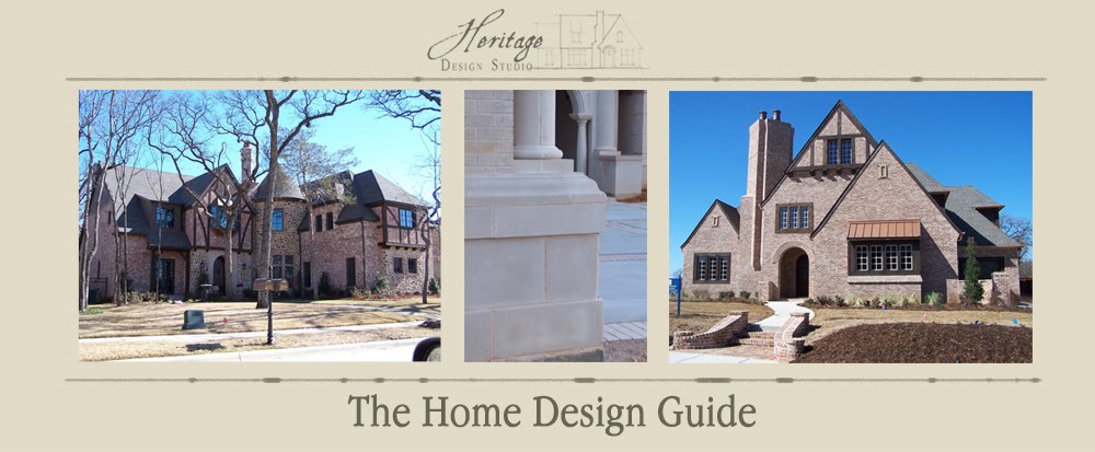
See, here in Texas, masonry is a VERY common material. Mostly because we have so much clay in the ground, there are several brick manufacturers located in state. Plus, most timber and wood has to be shipped as opposed to being milled locally. So, (to some extent) local materials shape the way that houses get designed due to the costs of what is available. You see a lot more siding and trim work in northern states where masonry is less available (which means "more expensive"). Which is why architectural styles such as Queen Anne, Craftsman, Shingle style, Georgian or Colonial Revival styles are more poplar in those locations than here in Texas.
Now, for some of the styles, contrast is perfectly appropriate. Particularly styles such as the Queen Anne and Craftsman, where the exterior is designed to be more elaborated, and colors help accentuate that detailing. Consider the below examples:
Here's another "Victorian Era" style: Second Empire (an American interpretation of French "Imperial" architecture).
Also highly decorative with a lot of "gingerbread" brackets and elaborated eaves. All the trim work has been painted a contrasting color to the siding wall surfaces. More subdued than the Queen Anne example above, but still using contrasting colors to accentuate the detailing of the exterior. And again, very appropriate to the architecture.
Here's a couple of Craftsman examples. The 1st one is from the Napa Valley Region (Calistoga I believe) and is a bed & breakfast we stayed in last year.
Like the above example, we have a dual tone going on, but very highly contrasting; which helps to accentuate some of the detail of the house. Perhaps a bit of artistic license taken here in where the red color was applied, but still a nice composition overall, and certainly a very nice example of Craftsman architecture. Interesting that the base which is a masonry foundation, was chosen to be the same color as the rest of the house and de-emphasis that portion of the house as opposed to accentuating the base from the structure above. Not typical, but it works well.
I chose this example because the colors here are quite subdued (compared to the above examples), although there is still the use of a more subtle contrast here to emphasis the detailing. I particularly like the columns on this house, which are highly stylized and different from the typical craftsman "tapered columns", but still express the craftsman architecture well.
So there are just a few examples where the architecture of the house really determines what is appropriate for the exterior. Within that though, you can see that there is still a wide variety of how the contrast is approached- from very expressive to subtle. I'd probably never in a million years be at the paint store and pick an orange brick with salmon pink and mint green and bright red accents as colors that would go well together on an exterior. But the 1st photo is exactly that- so someone understands color theory better than I do. But it's really the architecture that lets this example become successful- putting these colors on say a Colonial house or a Tudor would be tragic. So, in wrapping up, let me say that understanding the characteristics of the architecture that you are restoring (or reproducing) is key to it's success.


